How to Write a Seminar Presentation: Structure, Slides & Design Tips
A seminar presentation is a blend of research clarity, logical storytelling, and visual communication. It’s not just about putting information onto slides it’s about guiding your audience step by step from background → problem → approach → evidence → takeaway in a way that feels coherent, credible, and easy to follow.
Many seminar presentations fail not because the work is weak, but because the structure is unclear, the slides are overloaded, or the key message gets lost. A strong seminar solves these issues by focusing on clarity over complexity.
This article walks you through:
-
An ideal seminar presentation structure
-
What to include on each slide
-
Practical slide design tips that actually improve understanding (and grades)
What Makes a Strong Seminar Presentation?
A good seminar presentation consistently does three things:
1) Demonstrates subject understanding
Your audience should feel confident that you:
-
Understand the topic accurately
-
Used appropriate methods
-
Relied on credible and relevant sources
This doesn’t mean showing everything you know it means showing the right things clearly.
2) Communicates clearly
Clear communication comes from:
-
A simple narrative flow
-
Emphasizing key points instead of details
-
Logical progression between sections
If the audience gets confused midway, they mentally disengage even if your results are strong.
3) Looks easy to follow
Professional slides:
-
Reduce cognitive load
-
Highlight what matters
-
Support your spoken explanation
Clean design doesn’t mean “fancy.” It means intentional and readable.
A helpful way to think about your seminar is as a short academic story:
-
What is the topic?
-
What problem or gap exists?
-
What did you do?
-
What did you find?
-
Why does it matter?
If your presentation answers these five questions clearly, you’re on the right track.
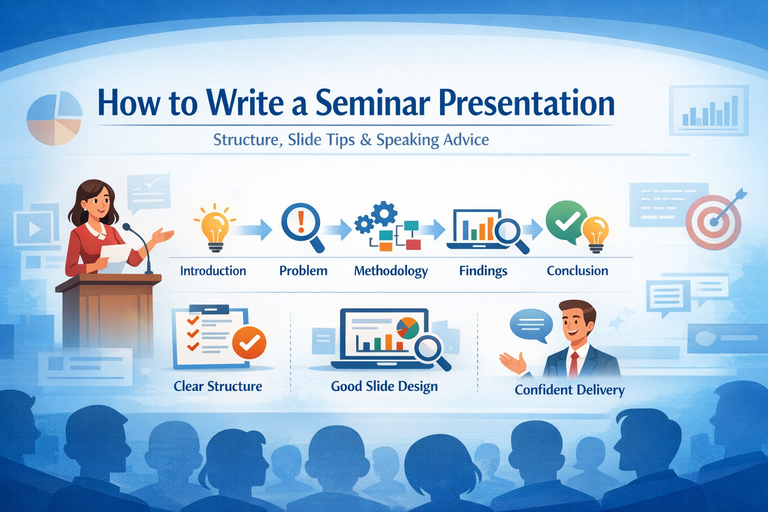
Ideal Seminar Structure (Slide-by-Slide)
Below is a standard structure that works for most seminars academic, technical, or project-based. You can adapt it depending on your field or time limit.
1) Title Slide
Purpose: Identify the topic and establish credibility immediately.
Include:
-
Seminar title (clear and specific)
-
Your name
-
Class / department
-
Institution
-
Supervisor or guide (if applicable)
-
Date
-
Optional: institutional logo (small and unobtrusive)
Tip
Avoid vague titles like “Seminar on Artificial Intelligence.”
Instead, hint at the problem or outcome, for example:
-
“A Comparative Study of Machine Learning Models for Credit Risk Prediction”
-
“Design and Implementation of an IoT-Based Smart Irrigation System”
Your title sets expectations use it strategically.
2) Introduction
Purpose: Give enough background so everyone starts on the same page.
Include:
-
Brief context (2–4 bullet points)
-
Why the topic matters (real-world relevance, industry demand, academic gap)
-
Key terms or concepts (only if the audience may not know them)
What to avoid:
-
Full literature reviews on slides
-
Long historical explanations
-
Dense paragraphs
Good slide goal:
The audience should understand what the topic is and why it matters within 60 seconds.
3) Problem Statement
Purpose: Clearly define the exact problem your seminar addresses.
This is one of the most important slides in your entire presentation.
Include:
-
The core problem (1–2 precise sentences)
-
Who or what it affects
-
Evidence that the problem exists
-
statistics
-
observed limitations
-
research gaps
-
Optional:
-
Constraints
-
Assumptions
Useful phrasing templates:
-
“Current approaches fail to ___ when ___.”
-
“There is a gap in ___ regarding ___.”
-
“The challenge lies in ___, resulting in ___.”
Tip
If your problem statement is vague, everything that follows will feel unfocused no matter how good your work is.
4) Objectives
Purpose: Tell the audience exactly what you aimed to achieve.
Include:
-
3–5 objectives maximum
-
Clear, measurable action verbs:
-
analyze
-
design
-
develop
-
compare
-
evaluate
-
measure
-
Optional:
-
Scope boundaries (what you did not cover)
Example formats:
-
“To evaluate the performance of ___ using ___ metrics.”
-
“To compare ___ and ___ under ___ conditions.”
-
“To design and implement a system that ___.”
Tip
Each objective should later connect directly to:
-
A method
-
A result
-
A conclusion
Ideally, there’s a one-to-one relationship.
5) Methodology
Purpose: Explain how you approached the problem.
This section often determines whether your audience trusts your results.
Include (depending on topic):
-
Research design (experiment, survey, simulation, case study, system design)
-
Data sources (datasets, participants, tools)
-
Procedure or workflow
-
Evaluation metrics (accuracy, efficiency, cost, time, etc.)
-
Tools and technologies used
Best practice
Use diagrams instead of text:
-
Flowcharts
-
Pipelines
-
System architectures
-
Block diagrams
Tip
Make your methodology auditable someone should understand your approach well enough to reproduce it at a high level.
6) Findings (Results)
Purpose: Present what you discovered clearly and honestly.
Include:
-
Results aligned with each objective
-
Visuals: charts, simplified tables, screenshots, outputs
-
Key values with labels and units
-
Brief interpretation of what the result means
Strong results slide structure:
-
Slide title: A conclusion-style headline
-
e.g., “Model A reduced prediction error by 18%”
-
-
Visual evidence in the center
-
2–3 bullets interpreting the result
Avoid:
-
Dumping raw tables
-
Overcrowded slides
-
Showing results without explanation
Tip
If you have many results, group them into themes. Show only the most important ones in the main presentation and keep extra material in backup slides.
7) Conclusion
Purpose: End with clarity, not repetition.
A conclusion is not a slide-by-slide recap.
Include:
-
3–5 key takeaways
-
Whether objectives were met (briefly)
-
Practical or academic implications
-
Limitations (1–2 points)
-
Future work or recommendations (if relevant)
Strong closing format:
Takeaway → Evidence → Impact
Example:
“We achieved ___, supported by ___, enabling ___.”
Your audience should walk away knowing why your work matters.
8) References
Purpose: Show credibility and academic integrity.
Include:
-
Key sources (not every source)
-
Consistent citation style (APA, IEEE, MLA follow department rules)
-
Clean, readable formatting
Tip
Cite sources lightly on content slides when relevant:
-
(Author, Year)
-
[3]
Full details belong on the reference slide.
Slide Design Tips (That Actually Improve Marks)
1) Use bullet points, not paragraphs
-
3–5 bullets per slide
-
One line per bullet when possible
-
Slides are prompts your speech is the explanation
If it reads like a report, it belongs in your report.
2) Avoid long blocks of text
Long paragraphs cause two problems:
-
The audience reads instead of listening
-
You end up reading the slide
Solutions:
-
One idea per slide
-
Use diagrams or tables
-
Move detail to speaker notes
3) Use diagrams wherever possible
Diagrams reduce confusion and improve recall.
Best visuals:
-
Flowcharts → methodology
-
Architecture diagrams → systems
-
Graphs → results
-
Timelines → development stages
-
Concept maps → frameworks
Always label axes, units, and legends.
4) Keep slides simple
Simplicity signals professionalism.
Clean slide checklist:
-
One idea per slide
-
Consistent layout
-
High contrast
-
Plenty of whitespace
-
Minimal animations (only to reveal steps)
Practical Formatting Guidelines
-
Title font: 32–44 pt
-
Body font: 20–28 pt (never below 18)
-
Fonts: Calibri, Arial, Helvetica
-
Colors: 2–3 max
-
Alignment: Left-aligned text
-
Images: High resolution, not stretched
-
Charts: 2D bar or line charts; avoid 3D
How Many Slides Should a Seminar Have?
General guideline:
-
1 slide per minute (or per 1.5 minutes)
Examples:
-
10 minutes → 8–12 slides
-
15 minutes → 10–15 slides
-
20 minutes → 12–18 slides
Quality always beats quantity.
Public Speaking Tips (So You Don’t Just Read Slides)
-
Open with a hook: question, statistic, or scenario
-
Signpost your structure early
-
Control your pace pause after key results
-
Make eye contact, not screen contact
-
Practice transitions between sections
-
Prepare answers to 5 likely questions
Presentation and communication ebooks can be especially helpful for learning how to structure explanations, sound confident, and handle Q&A smoothly.
A Simple Seminar Slide Template (Copy-Paste Outline)
-
Title
-
Introduction / Background
-
Problem Statement
-
Objectives + Scope
-
Methodology Overview (diagram)
-
Methodology Details
-
Findings 1
-
Findings 2
-
Conclusion
-
References
-
Backup slides (optional)
Final Checklist Before You Present
-
Does each slide have a clear purpose?
-
Is the flow understandable without reading paragraphs?
-
Are the problem and objectives specific and measurable?
-
Do findings connect directly to objectives?
-
Are visuals readable from the back of the room?
-
Does the conclusion emphasize takeaways, not recap?
-
Have you practiced at least twice with a timer?
A well-structured seminar doesn’t just share information it builds confidence in your work